Mastering the Color Blocking Trend with Solid Nail Wraps
Ready to make a statement with your nails? Color blocking is taking the world by storm, and your fingertips are the perfect canvas for this vibrant trend. But what exactly is color blocking, and how can we achieve this look with ease? We’ll dive into the diverse world of color blocking and the magic of our solid nail wraps!
What is Color Blocking?
Color Blocking is a design technique that involves using bold and contrasting colors in distinct, well-defined blocks to create a striking visual impact. Imagine a painting made up of large squares or rectangles of different colors, each standing out against the others.
While often associated with fashion, color blocking can be applied to various artistic disciplines, including interior design, graphic design, and, of course, nails!!!!
Why solid nail wraps?
You’ll never go wrong with solids, as they say! 😉 Solid wraps are always a go-to because they offer versatility and simplicity, making them easy to style with various styles or looks. These wraps serve as a foundation for the Color Blocking trend by providing a solid base on which bold and contrasting colors can be layered to add visually striking combinations. Whether you opt for complementary hues or bold contrasts, solid wraps offer endless possibilities for creating unique and stunning looks! ✨
Understanding The Color Theory
Explanation of the basics
Hue, saturation, and value (more commonly known as HSV) are the fundamental building blocks of color. They work together to create a vast spectrum of colors we see. By understanding these three aspects, we can effectively create a wide range of visual effects while we express true emotions and individuality.
Think of hue as the actual color name itself. It’s the most basic distinction between colors, like red, blue, green, yellow, and so on. Each section on the color wheel represents a different hue. Why is it important to understand hue? It’s because hue forms the basis for color mixing, color harmony, and the overall look.
It refers to the intensity or purity of a color. It’s important to understand saturation because it plays a big role in creating the tone and emotion of your look. Here are some important things to remember:
- Highly saturated color is vibrant and bold, with no gray or white mixed in. It tends to grab attention and evoke strong emotions.
- As saturation decreases, the color becomes duller and grayer. It then creates a more subtle and sophisticated look.
- Lastly, at 0% saturation, you will get a shade of gray, regardless of the original hue.
Value refers to the degree of lightness or darkness of a color. It determines how light or dark a color appears, regardless of its hue or saturation. In simple terms –
- A color with a high value is light (e.g. bright yellow)
- A color with a low value is dark (e.g. navy blue, deep purple)
- You can change the value of a color by adding black (to darken) or white (to lighten), without affecting the actual hue.
Overview of Color Harmonies
Color harmony refers to the pleasing arrangement of colors together. By understanding color harmonies, you can create visually appealing and balanced compositions.
The Color Wheel
It’s a fundamental tool used in color theory. It visually represents the relationship between colors. Primary colors (red, yellow, and blue) are positioned at equal distances from each other, and secondary colors (orange, green, and purple) are created by mixing primary colors. Tertiary colors are created by mixing a primary and a secondary color.
There are several ways to achieve color harmony, but some of the most common and effective methods include:
- Complementary Colors
These are located directly opposite each other on the color wheel. When placed side by side, they create a strong contrast and vibrant effect, making them ideal for eye-catching designs.
- Analogous Colors
These colors are located next to each other on the color wheel. They share a common hue and create a harmonious and soothing effect when used together. Analogous color schemes are often found in nature and can be used to create calming and cohesive designs.
- Triadic Colors
These are three colors evenly separated around the color wheel. They create a vibrant, dynamic effect, but beware, as they can also be overwhelming if not used carefully. To achieve balance, consider using one color as the dominant color and the other two as accents.
- Tetradic Colors
Tetradic colors consist of four colors arranged in two complementary pairs. They offer the most variety but can be the most challenging to use effectively. To create a balanced tetradic scheme, use one color as dominant and the other as accents.
- Monochromatic Colors
A monochromatic color scheme uses variations of a single color, including its tints (lighter shades) and (darker shades). This creates a sophisticated and unified look.
Color Blocking Techniques with our Solid Nail Wraps
Complementary Colors (Simple Two-Color Blockings)
Complementary colors refer to pairs of colors that, when combined, produce a neutral or white result. In simple two-color blockings, complementary colors are often used to create contrast and visual interest by placing them adjacent to each other. This contrast enhances the vibrancy of each color, making them appear more intense when paired together.
BLUE + ORANGE = Balanced Contrast
A dynamic duo that ignites energy and vitality. This combination creates a harmonious relationship between contrasting elements, showcasing a perfect balance of tranquility and vibrancy.

Get Notified for Back-in-Stock: Blue Christmas and Under Construction
BLUE-GREEN + RED-ORANGE = Sweet and Deep
The combination of blue-green and red-orange creates a captivating contrast and can be visually striking and attention-grabbing. You’ll definitely be a head-turner with this combination! These colors are both sweet-toned and bold, infusing your nail art with lively energy and depth.

Get Notified for Back-in-Stock: Let’s Be Mermaids and Watch Out!
GREEN + RED = Timeless Abundancy
Green and red, are a classic pairing that exudes timeless elegance and festive cheer, creating a harmonious yet vibrant statement in nail art. This combination not only evokes a seasonal statement but also an all-year-round of abundance and prosperity.

Get Notified for Back-in-Stock: Glowing Green and Lick My Lips
YELLOW GREEN + VIOLET RED = Fresh Harmony
The fusion of yellow-green and violet-red offers a harmony that combines freshness and warmth, adding a lively and serene coolness to your overall look.

Get Notified for Back-in-Stock: Key Lime Pie and Raspberry Liquorice
YELLOW + PURPLE = Royalty and Luxury
Yellow’s bright and energetic hue contrasts with purple’s deep and mysterious color, creating a dynamic yet visually creative contrast. Together, these colors create a sense of wealth and cheerfulness. Go ahead and create that luxurious look, girl! 😉

Get Notified for Back-in-Stock: I Dare You and Pretty In Purple
VIOLET-BLUE + YELLOW-ORANGE = Tranquil Fusion
Yellow-orange and violet-blue merge to form a visually stunning variance, blending warmth and coolness for a captivating look. Combining these colors can definitely create a fusion of intuition and creativity, helping you unleash your unique personality.

Get Notified for Back-in-Stock: Point Break
Get The Look: Tangerine Dream
Analogous Colors (Three or Four-Color Blockings)
Analogous colors in three or four-color blockings involve selecting hues that sit close to each other on the color wheel. This creates a harmonious and coordinated aesthetic, perfect for achieving balanced and sophisticated nail art designs.
RED + RED-ORANGE + ORANGE = Bold and Vibrant
Mixing red, red-orange, and violet in an analogous color scheme creates a dynamic palette, infusing your nail art with a fascinating blend of warmth and depth. As the color transitions from one hue to the next, it creates a burst of energy and inspiration. These colors will give you the courage to stand out and make a statement! Slay it, girl!

Get Notified for Back-in-Stock:
BLUE + BLUE-VIOLET + VIOLET = Cool and Chill
Combining blue, blue-violet, and violet in an analogous color scheme creates a sophisticated palette, blending shades that are adjacent to each other for a pleasing aesthetic in your nail art. As the color progresses from blue to violet, it gradually intensifies, creating a sense of deep relaxation and serenity.

Get Notified for Back-in-Stock:
YELLOW + YELLOW-GREEN + GREEN + BLUE-GREEN = Vibrant and Lively
Blending shades of yellow, yellow-green, green, and blue-green results in a vibrant and cohesive color palette, ideal for creating dazzling and lively nail art designs. This combination of colors will surely add a lively pop to your overall ensemble!

Get Notified for Back-in-Stock:
Get The Look: Mermaid Blue
Triadic Colors (Three-Color Blockings)
Triadic colors, in the context of three-color blockings, involve selecting hues that are evenly spaced around the color wheel. This creates and balanced color scheme, with each color providing contrast and complementing the others. Triadic color combinations often result in vibrant and visually striking compositions, making them popular choices in various form of art and design.
ORANGE + GREEN + VIOLET = Fresh Sophistication
The fusion of orange, green, and violet in a triadic color scheme results in a lively and balanced palette, providing versatility and visual interest for striking nail art creations. Orange brings warmth and energy, green adds freshness and balance, while violet contributes depth and sophistication.

Get Notified for Back-in-Stock:
YELLOW + BLUE + RED = Energetic Opportunities
Yellow adds brightness and warmth, blue brings coolness and depth, while red infuses energy and intensity. Blending yellow, blue, and red in a triadic color scheme yields a vibrant and balanced palette that offers endless creative opportunities for bold and visually striking nail art.

Get Notified for Back-in-Stock:
PINK + TEAL + MUSTARD = Soft and Feminine
Pink, teal, and mustard create a sophisticated color palette when combined. The pink adds a soft and feminine touch, while the teal brings a vibrant and refreshing feel. Mustard adds warmth and depth to the combination. Together, they offer versatility and visual interest.

Get Notified for Back-in-Stock:
LILAC + SAGE GREEN + PEACH = Calming Elegance
Combining lilac, sage green, and peach results in a soft color palette. Lilac adds a delicate and feminine touch, while sage green provides a subtle and calming contrast. Peach brings warmth and vibrancy to the combination. Together, they create a refreshing and elegant color scheme that is perfect for creating serene nail designs.

Get Notified for Back-in-Stock:
Tetradic Colors (Four-Color Blockings)
Tetradic colors, in the context of four-color blockings, involve selecting hues that are evenly spaced around the color wheel. This creates a dynamic and balanced color scheme., with each color providing contrast and complementing the others. Tetradic color combinations offer a wide range of possibilities for creating visually striking and harmonious compositions in various forms of art and design.
GREEN + BLUE + RED + ORANGE = Tranquil Yet Exciting
In a tetradic color scheme, green, blue, red, and orange are selected to create a vibrant and balanced palette, with each color complementing the others. Green brings a sense of tranquility and freshness, blue adds depth and stability, red injects energy and warmth, while orange infuses vibrancy and excitement. Together, they create endless possibilities for creative expression.

Get Notified for Back-in-Stock:
YELLOW + VIOLET + GREEN + RED = That Young, Happy Feeling
In a tetradic color scheme; yellow, violet, green, and red are selected from points that are evenly spaced around the color wheel. This creates a dynamic and vibrant palette, with each color providing contrast and complementing the others. Yellow brings warmth and brightness, violet adds depth and richness, green offers freshness and balance while red injects energy and intensity. Together, they create a visually striking combination that offers endless possibilities for creative expression.

Get Notified for Back-in-Stock:
Get the Look: Tropical Waters
Monochromatic Colors (Three or Four-Color Blockings)
In the context of three or four-color blockings, monochromatic colors involve using various shades, tints, and tones of a single hue. This creates a harmonious and cohesive color scheme, with subtle variations in brightness and saturation adding depth and interest to the design. Monochromatic color palettes are versatile and elegant, offering a sophisticated and timeless aesthetic suitable for a wide range of applications in art and design.
Love Pink? Knock yourself out with the delicate charm of springtime with this collection of pink nail wraps. Soft petal tones like freshly bloomed roses give way to a flirty, mid-tone pink, perfect for capturing the essence of a carefree summer day! As the shade deepens to a rich rose hue, a touch of sophistication appears, ideal for a touch of elegance in your everyday look.

Get Notified for Back-in-Stock:
Embrace the beauty of a clear sky with these dreamy power blue nail wraps. The colors unfold like a gentle watercolor painting, transitioning from a light, airy blue that whispers serenity, to a slightly deeper, serene powder blue that evokes feelings of calmness and trust. These versatile wraps add a touch of elegance to your nails, making them perfect for any occasion!

Get Notified for Back-in-Stock:
Unwind and find inner peace with these calming nail wraps. Inspired by the tranquility of nature, the color unfolds like a walk through a forest bathed in morning sunlight. The shades gently transition from a light, almost ethereal sage, reminiscent of a gentle breeze to a deeper, more grounded shade that evokes feelings of stability and growth. These wraps are the perfect choice for those who seek a touch of sophistication with a natural flair.

Get Notified for Back-in-Stock:
Give yourself up to a world of soft, ethereal beauty with these lilac and lavender nail wraps. These colors unfold a fragrant spring garden, transitioning from a light, wispy lilac, reminiscent of the first blooms of the season, to a deeper, calming lavender that evokes feelings of serenity and peace.

Get Notified for Back-in-Stock:
Embrace the timeless style with this collection of classic beige nail wraps. These colors offer a spectrum of comforting neutral colors. Starting with a soft, creamy ivory and moving to a warmer, slightly golden beige. These versatile nail wraps complement any outfit and add a touch of sophistication and elegance to your nails.

Get Notified for Back-in-Stock:
Timeless Trio
You can’t go wrong with the classic and timeless trio: black, white, and gray. These shades, while not technically colors on the traditional color wheel, offer endless possibilities for chic and impactful nail wraps. They occupy a special place because they they lack inherent hue, but they’re varying darkness and lightness create a stunning foundation for color blocking.

Get the Look:
Let’s go further and appreciate the subtle beauty of grays with these versatile nail wraps. A calming pebble, the color unfolds like a gentle gradient, starting with a light, pearl gray and transitioning to a deeper, smoky gray that evokes feelings of strength. These wraps are perfect for those who appreciate a timeless, understated look.

Get Notified for Back-in-Stock:
Pro Tips and Tricks to Color Blocking

Pixabay Stock Photo by geralt
Life is better with color! It is a lot of fun to experiment with colors and fashion until you find your own style and expression! We’re here to help bring that most alluring color-blocking ensemble for you by sharing some tips and tricks, and some do’s and don’ts.
Tip #01
When in doubt and starting out with colors, it’s always best to start simple. You can start with your favorite neutral, like black, navy, or gray, and then add a high contrast to that color, like something brighter.
We highly recommend experimenting with a navy blue skirt, an electric blue shirt, and a baby blue belt for a chic and edgy everyday look.
Tip #02
Don’t add too many colors so you don’t lose the essence of color blocking. It’s best to start small, and like in stories, the rule of three is your best friend to nail the color-blocking assignment.
Another option is to opt for a stunning blush dress or jacket complemented by blush satin heels or black boots and white sneakers so you are fashionable on the go!

Canva Stock Images
Tip #03
Nail it with layering! When you're color-blocking, it's essential to keep in mind that your boldest color should be your outer layer. Avoid wearing a lighter neutral color on top of a nice bright top, as this can look weird.
This is an excellent rule for beginners to follow to achieve a polished look. Once you feel more comfortable with color blocking, you can experiment with other ways of layering.
Tip #04
Accessorize! If you’re confident about wearing bright colors, accessorize with a handbag or add a bright belt or bright shoes. Just think of each piece as one block of color. Hats and sunglasses also come in handy!
Transitioning your look into the new season is also a great way to play with your color-blocking techniques. Take those bright colors of the summer-like fuchsia and add a darker tone like burgundy, and you have an outfit that will transition into a new season easily.

Canva Stock Images
Trust us, you'll turn heads with these fabulous outfits, especially when you pair them with a solid nail wrap, making it the perfect OOTD for fun occasions!

Canva Stock Images
Our trusty customers are our go-to’s when it comes to displaying their nails and matching them with their OOTDs! They really know how to pull off our solid colors that are perfect for color-blocking.

Watch Out! by Lilly on Facebook

Swim Out Deep by Amy Grace on Facebook

Bellucci by Elisa on Instagram

Atlantis by Rebecca on Instagram
So, go ahead and enjoy the exciting color wheel! Color blocking using solid nail wraps offers a chic and versatile way to experiment with vibrant hues and bold colors. Whether you’re aiming for a playful look or a sophisticated statement, the Color Blocking Trend surely allows you to enjoy endless creativity and customization. But wait, there’s more! 🙂 This trend encourages everyone to explore their individuality and self-expression, empowering you to discover new color combinations and unleash your dashing creativity!
What are you waiting for? 😉 Go and embrace the power of color to express your unique style and elevate your nail experience with the dynamic trend!
Also in Blog

Got a Brilliant Mani Idea? Lily & Fox Wants to Hear It!
We know you love expressing yourself through your nails, and we constantly see your passion for unique styles, vibrant patterns, and exciting themes. Many of you have even reached out with brilliant ideas, asking, "Can Lily & Fox create a specific design I've dreamed up?"
This blog post will detail exactly how you can submit your fantastic design ideas, give you a peek into the kind of inspiration we're looking for.

From Ziplocks to Binders: How Our Customers Store Their Wraps (and Why Our New Binders Just Changed the Game!)
One of the best parts of being in the Lily & Fox community is seeing just how creative everyone gets with their nail wrap collections. Every time we ask about storage, we’re amazed by the clever, resourceful, and sometimes downright hilarious setups you share. It’s a reminder that nail wraps aren’t just about the manicure—they’re a lifestyle, and even the way you store them becomes part of the fun. So let’s take a little tour through what we like to call the evolution of wrap storage, from simple beginnings to full-on collector strategies.
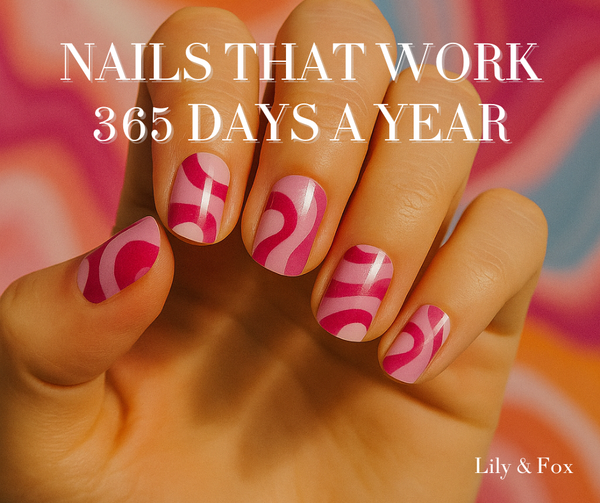
Nails That Work 365 Days a Year
At Lily & Fox, we believe your nails shouldn’t come with an expiration date. That’s where seasonless nail wraps come in: colors and designs that look good every single day of the year. Whether you’re heading to the office, hitting a wedding, or just grabbing coffee in sweats, seasonless wraps keep your nails polished, stylish, and totally stress-free.








Rebecca Fox
Author